


Color wields a profound influence in the realm of web design, transcending mere aesthetic appeal to touch upon the very way users perceive and interact with a website. It is a silent communicator, capable of conveying mood, eliciting emotional responses, and even shaping decisions. Where users often make split-second judgments, the role of color becomes all the more critical.
We are going to discuss the multifaceted impact of color in web design, exploring its psychological underpinnings, its significance in branding, the imperative of accessibility, current trends, and practical strategies for effective color selection. By understanding the nuanced interplay of colors, designers can craft experiences that not only captivate and engage, but also reinforce brand identity and improve usability. Through this article, we aim to provide a complete overview of how color can be leveraged to create more impactful and meaningful web designs.
1) The Psychology of Color

Understanding Color Psychology
At the heart of color’s impact on web design is color psychology, a field that examines how hues can influence perception and behavior. Colors have the power to evoke specific emotions and reactions; for example, blue can convey a sense of trust and calm, while red might trigger feelings of excitement or urgency. This psychological effect is crucial for web designers to consider, as it can significantly affect user engagement and conversion rates. By carefully selecting a color palette, designers can create a desired atmosphere on the website, aligning with the site’s purpose and audience’s expectations.
Color and Emotional Response
The emotional response to color is both innate and conditioned, varying across different cultures and individuals. For instance, green is often associated with nature and growth, evoking feelings of peace and renewal, which makes it a popular choice for health and environmental websites. Understanding these emotional connotations allows designers to use color as a tool to align a website’s aesthetic with its intended message and user experience goals.
Color Harmony and Contrast
Achieving color harmony is essential for creating visually appealing and coherent web designs. Harmony refers to the pleasing arrangement of colors, which can be achieved through various schemes like analogous, complementary, or triadic. Contrast, on the other hand, involves the use of opposing colors to make elements stand out. High contrast color combinations are particularly effective for call-to-action buttons or for ensuring legibility of text.
Cultural Context of Color
Colors carry different meanings and associations across cultures, making cultural context a critical consideration in web design. For example, while white is traditionally associated with purity and weddings in Western cultures, it is linked to mourning in many Eastern cultures. Web designers targeting a global audience must navigate these cultural nuances to avoid misinterpretation and ensure the website communicates effectively across cultural boundaries.
Psychological Principles in Action
Applying color psychology in web design goes beyond selecting attractive colors; it involves strategic thinking about how color choices align with the website’s goals and user needs. For instance, using warmer colors like orange and yellow can create a sense of warmth and welcome, encouraging user interaction, while cooler colors like blue and green can enhance a sense of professionalism and trustworthiness.
Incorporating psychological principles into color selection not only enhances the aesthetic value of a website but also its functionality and user experience. By understanding the psychological effects of colors, designers can make informed choices that enhance user engagement, facilitate navigation, and contribute to the site’s overall success.
2) Color and Branding
Color is not just a visual element in web design; it’s a powerful branding tool that communicates identity and values at a glance. This section explores the integral role of color in branding, highlights successful case studies, and offers strategies for choosing a color scheme that aligns with brand values.
The Role of Color in Branding
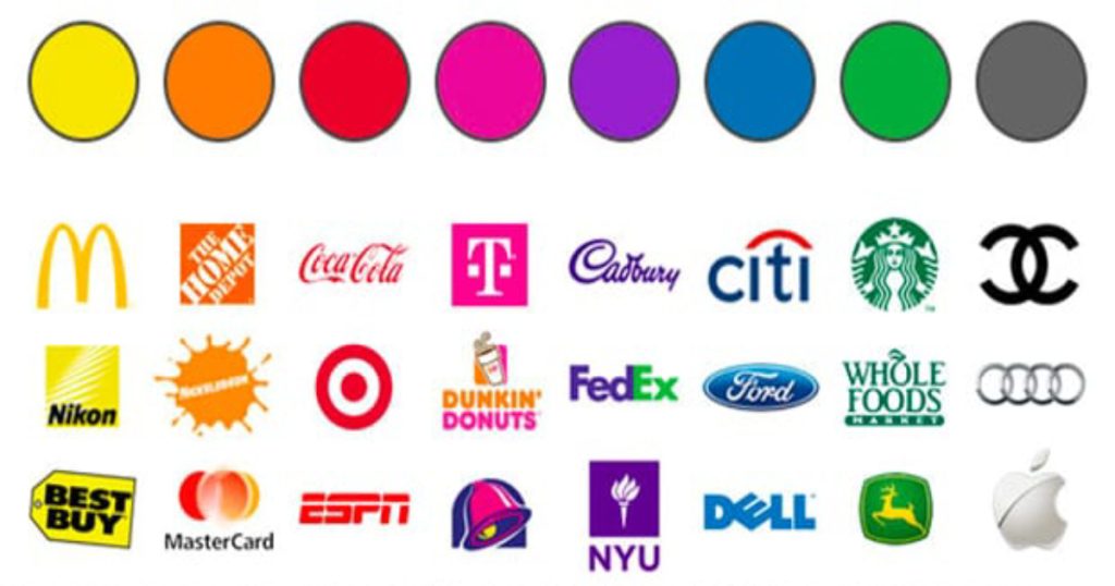
Color can significantly influence brand perception, making it an essential element of branding strategy. The right color choice can enhance brand recognition, convey brand values, and differentiate a brand from its competitors. For instance, Tiffany & Co.’s distinctive robin’s egg blue box is as iconic as the luxury items it contains, instantly communicating the brand’s elegance, uniqueness, and value.
A brand’s color scheme needs to resonate with its target audience, evoke the desired emotions, and reflect the brand’s personality. Whether it’s the excitement red provokes or the trust blue generates, color choices must be deliberate and aligned with how a brand wants to be perceived.
Case Studies of Successful Brand Color Schemes
- Coca-Cola: The brand’s iconic red color is recognizable worldwide, symbolizing energy, passion, and action. This color choice has helped Coca-Cola stand out in the beverage industry, making it synonymous with refreshment and happiness.
- Apple: Apple utilizes a clean, minimalist color palette dominated by white and gray, emphasizing simplicity, innovation, and sophistication. This approach has helped Apple create a sleek, modern brand image that aligns with its cutting-edge products.
- Starbucks: The green color of Starbucks evokes feelings of freshness, growth, and sustainability. It reflects the company’s commitment to quality and ethical sourcing, creating a welcoming atmosphere for coffee enthusiasts worldwide.
- Netflix: The bold red used by Netflix stimulates excitement and urgency, encouraging viewers to engage with their platform. This color choice has become synonymous with entertainment and binge-watching, establishing Netflix as a leading streaming service globally.
- Facebook: Facebook’s signature blue color exudes trust, reliability, and connectivity. It fosters a sense of community and communication, making users feel comfortable and secure while interacting with the platform. The blue hue has become inseparable from Facebook’s identity, representing its role as a social networking giant.
- Amazon: Amazon’s orange-yellow arrow in their logo symbolizes forward movement and progress. This color choice conveys a sense of innovation, efficiency, and customer satisfaction, reflecting Amazon’s commitment to delivering products quickly and reliably. The arrow also suggests endless possibilities, mirroring Amazon’s vast selection and continuous expansion into new markets.
These examples demonstrate how effectively chosen color schemes can embody a brand’s essence and values, contributing to its recognition and emotional appeal.
Strategies for Choosing a Color Scheme
Selecting a color scheme for a brand involves more than just aesthetic preference; it requires a strategic approach that considers psychology, target audience, and market positioning. Here are some strategies to guide this process:
- Understand your brand’s personality and values: Choose colors that reflect these elements. For instance, green can be ideal for eco-friendly brands, while purple might suit luxury or creative brands.
- Consider your target audience: Different demographics and cultures may have varying responses to colors. Research and understand your audience’s preferences and cultural connotations of colors.
- Analyze competitors: Look at the color schemes of your competitors to identify opportunities to stand out. Choosing a distinct color can differentiate your brand in a crowded market.
- Test and refine: Use A/B testing and user feedback to refine your color choices. What works in theory may not always resonate with your audience in practice.
Integrating Color with Overall Brand Strategy
Once a color scheme is chosen, it should be consistently applied across all brand touchpoints, from the website and logo to packaging and marketing materials. Consistency reinforces brand recognition, making your brand more memorable and recognizable to consumers.
The strategic use of color in branding can significantly impact how a brand is perceived and remembered. By carefully selecting a color scheme that aligns with brand values and resonates with the target audience, brands can enhance their identity and emotional appeal. Color is not just a detail in branding; it’s a critical component that can drive recognition, differentiation, and loyalty.
3) Accessibility and Color Contrast

Accessibility in web design ensures that websites are usable by as many people as possible, including those with disabilities such as vision impairments. Color contrast plays a crucial role in this, impacting the readability and navigability of online content. This section explores the importance of color contrast in web accessibility, guidelines for creating accessible color schemes, and the impact on users with color vision deficiencies.
Importance of Color Contrast
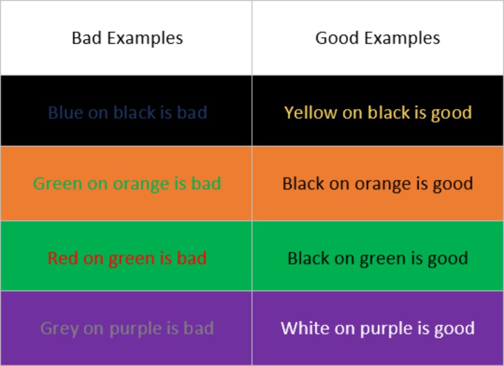
Color contrast refers to the difference in light between font (or foreground) and its background, significantly affecting the legibility of text on websites. High contrast between text and its background is essential for users with low vision or color blindness, as it helps distinguish text from the background, making the content accessible to a wider audience. Additionally, sufficient contrast benefits users in low-light conditions or those viewing screens in sunlight.
Guidelines for Accessible Color Schemes
The Web Content Accessibility Guidelines (WCAG) provide specific criteria for color contrast to ensure web content is accessible. According to WCAG 2.1, the minimum contrast ratio for normal text is 4.5:1, and for large text, it is 3:1. These guidelines help designers create content that is more accessible to individuals with visual impairments.
Designers can use various tools and resources, such as the Color Contrast Checker by WebAIM, to test color combinations for compliance with accessibility standards. These tools are invaluable for ensuring that web designs meet the needs of all users, regardless of their visual capabilities.
Impact on Users with Color Vision Deficiencies
Color vision deficiencies (CVD), including various forms of color blindness, affect a significant portion of the population. Design choices must consider these differences in perception to avoid reliance on color as the sole means of conveying information. For example, using textures or patterns in addition to color can help differentiate elements for users with CVD.

Strategies such as ensuring high contrast, avoiding problematic color combinations (like red-green), and providing alternative means of information (text labels or icons) can make a website more accessible and inclusive.
Designing for Accessibility and Inclusivity
Incorporating accessibility into the design process from the start is more effective and efficient than making adjustments later. This proactive approach not only benefits users with disabilities but also improves the overall user experience for everyone. Accessibility should be seen not as a constraint but as an opportunity to innovate and reach a broader audience.
Designers and developers are encouraged to engage with the broader community, including users with disabilities, to receive direct feedback on accessibility. This engagement can lead to more empathetic and inclusive design solutions that cater to a diverse user base.
Focusing on accessibility and color contrast is essential for creating inclusive web designs that cater to the needs of all users, including those with visual impairments. By adhering to established guidelines and employing creative solutions to meet these standards, designers can ensure their websites are not only aesthetically pleasing but also universally accessible. The commitment to accessibility reflects a broader commitment to diversity and inclusion, emphasizing the importance of designing digital experiences that everyone can enjoy.
4) Color Trends in Web Design

Keeping abreast of color trends in web design is crucial for designers looking to create modern and relevant websites. Trends can reflect shifts in culture, technology, and user preferences, influencing how audiences perceive and interact with digital content. This section discusses current color trends in web design, their impact on user expectations, and how to balance trendiness with brand identity.
Overview of Current Color Trends
Color trends evolve, influenced by broader societal trends, technological advancements, and industry innovations. Some current trends in web design include:
- Bold and Vibrant Colors: Bright, saturated colors are being used to grab attention and make bold statements. These palettes are often paired with simple layouts to keep the focus on the color.
- Pastel and Muted Tones: In contrast to bold colors, there’s a trend towards soft, muted, and pastel shades, offering a calming and minimalist aesthetic that appeals to users seeking tranquility in the digital space.
- Dark Mode: Dark backgrounds with light text have gained popularity for their aesthetic appeal and practical benefits, such as reduced eye strain and lower energy consumption on OLED and AMOLED screens.
- Gradient 2.0: Gradients have made a comeback, with more complex and subtle applications than their previous incarnations. They’re used to add depth, interest, and a modern feel to designs.
- Duotones and Color Filters: These techniques, involving two contrasting colors or varied color filters, create striking visual effects that enhance imagery and layouts.
Impact on User Expectations
Color trends can significantly influence user expectations. Users browsing modern websites anticipate designs that reflect current styles and aesthetics. Incorporating these trends can make a website feel more contemporary, engaging, and in tune with the user’s visual language. However, it’s crucial to apply trends thoughtfully, ensuring they align with the brand’s identity and message rather than following them for their own sake.
Balancing Trends with Brand Identity
While it’s beneficial to stay current with color trends, it’s vital to balance these trends with your brand’s identity and values. The key is to adapt trends in a way that complements the brand, rather than overshadowing it. For instance, a brand known for its eco-friendly values might incorporate current trends by using modern gradients in earthy tones, aligning the trend with its brand identity.
Designers should also consider the longevity of their color choices. While it’s tempting to adopt the latest trends, creating a timeless design that incorporates trend elements in a subtle, adaptable manner can ensure the website remains effective and appealing long-term.
Color trends offer valuable insights into current design preferences and user expectations, serving as inspiration for web designers. By thoughtfully integrating these trends with a brand’s identity and values, designers can create websites that are both modern and timeless. Staying informed and adaptable allows designers to leverage trends to enhance user experience and engagement, ensuring their designs remain at the forefront of digital innovation.
5) Practical Tips for Choosing Color Schemes
Selecting the right color scheme is pivotal in web design, as it affects the overall aesthetic, user experience, and brand perception. This section provides practical tips and resources for designers to create effective color schemes, ensuring their choices enhance the website’s appeal and functionality.
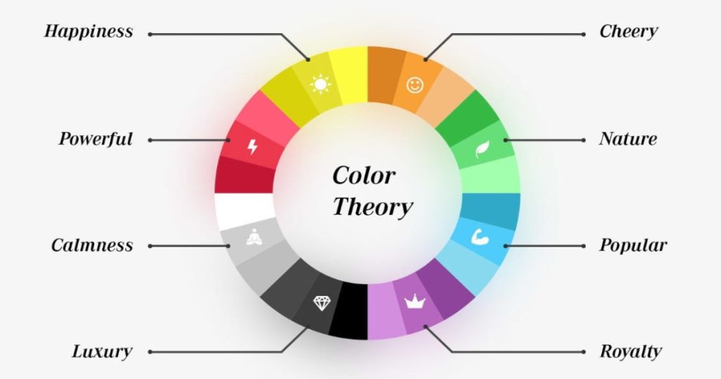
Understanding Color Theory
The first step in choosing a color scheme is to understand basic color theory. Color theory helps designers understand the relationship between colors and how they interact. It includes concepts like the color wheel, color harmony, and the psychological effects of colors. Familiarity with these principles can guide designers in making informed decisions about color combinations that are visually appealing and convey the desired mood or message.
Tools and Resources for Color Schemes
Several online tools can assist designers in developing and testing color schemes:
- Adobe Color: This tool allows designers to explore and create color schemes based on various rules of color theory, such as analogous, monochromatic, or complementary colors.
- Coolors: Coolors generates color schemes quickly and allows users to adjust and refine palettes to suit their needs.
- Color Hunt: Color Hunt offers a curated collection of color palettes created by a designer community, providing a source of inspiration and ready-to-use schemes.
Using these tools, designers can experiment with different palettes and visualize how color choices might look in their designs.
Consider the Audience and Context
The target audience and context of the website play a crucial role in color scheme selection. Different demographics may have varying responses to colors based on cultural, social, or personal factors. Additionally, the website’s purpose—whether it’s to inform, sell, entertain, or educate—should influence color choices. A website for a children’s toy store might use bright, primary colors to evoke fun and energy, while a legal consultancy website might opt for a more subdued, professional palette.
Test and Refine
Once a color scheme is chosen, it’s essential to test it with real users and in different contexts. This testing can include looking at the color scheme on various devices and under different lighting conditions to ensure it remains effective and accessible. A/B testing different color schemes can provide valuable insights into user preferences and how color choices impact user behavior and conversion rates.
Integration with Overall Design Strategy
A color scheme should be integrated into the overall design strategy, considering elements like typography, imagery, and layout. Consistency in color usage across all brand touchpoints reinforces brand identity and enhances user experience. The color scheme should complement other design elements, creating a cohesive and harmonious visual experience that aligns with the brand’s goals and values.
Choosing the right color scheme is a critical component of web design, influencing both aesthetic appeal and user engagement. By understanding color theory, utilizing design tools, considering the audience, testing and refining choices, and integrating color with the overall design strategy, designers can create compelling and effective websites. These practical tips and resources empower designers to make informed decisions, ensuring their color schemes enhance the user experience and support the brand’s objectives.
Final Thoughts
Throughout this article, we’ve explored the multifaceted impact of color in web design, from the psychological influence of colors on user behavior to the strategic role of color in branding and accessibility. We’ve seen how color can evoke emotions, convey messages, and significantly enhance the user experience. By understanding and applying color theory, designers can create visually appealing, accessible, and effective websites that resonate with their target audience and reinforce brand identity.
The case studies and practical tips provided underscore the importance of thoughtful color selection and the need for ongoing testing and refinement. As web design continues to evolve, staying informed about color trends and accessibility standards will remain crucial for creating engaging and inclusive digital experiences.
Color is not just an aesthetic choice; it’s a powerful communication tool. By leveraging the psychological effects of color, considering cultural implications, and prioritizing accessibility, designers can craft websites that not only look great but also perform well, meeting the diverse needs of their users. In the dynamic world of web design, color remains a key element in capturing attention, driving engagement, and fostering positive user experiences.
If you need help selecting the appropriate colors for your website, don’t hesitate to contact us!